Learn Advanced Excel Course, MS Excel & MS Word Course Online
EXCEL
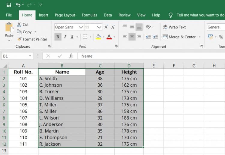
Formulas and functions in Excel.Microsoft Excel is used to store, organize, and track data sets. Excel is used for organizing, filtering, and visualizing large amounts of data. MS Excel is extremely popular because spreadsheets are highly visual and fairly ease to use. MS Excel is commanly used for business analysis, managing human resources, performance reporting, and operations management
VBA
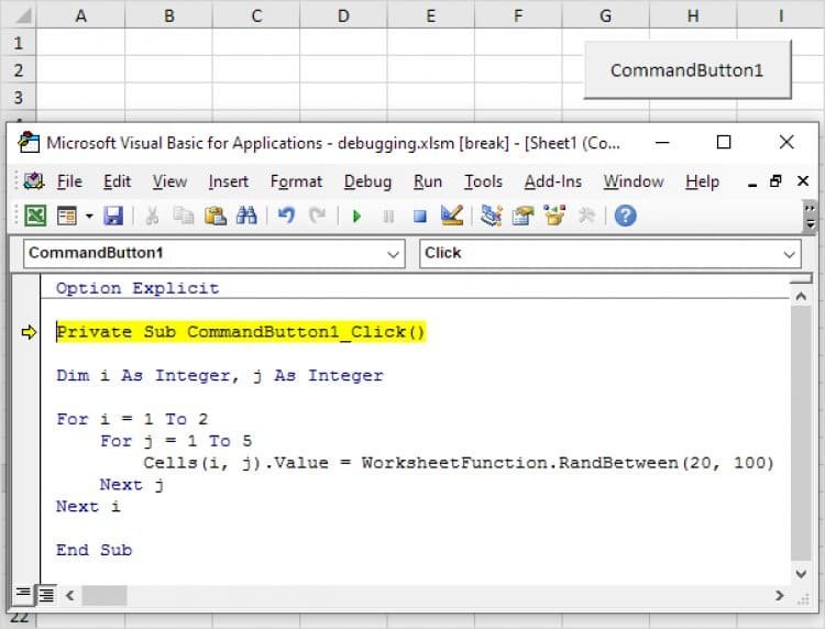
Excel VBA Online Course. VBA (Visual Basic for Applications) is the programming language of Excel and other Office programs. With Excel VBA you can automate tasks in Excel by VBA Because VBA is integrated into Excel, coding is very intuitive. Beginners can learn VBA very quickly! Microsoft Excel VBA (Visual Basic for Applications) is a programming language specifically for Excel that allows you to program your spreadsheet
WORD
Learn MS Word. What is use MS Word . MS WORD is a word-processing package. WOrd is used in Creating text, editing annd Formatting documents. MS Word helps in Making a text document interactive with Graphical elements, comprising images. MS word is used mainly for creating documents, such as brochures, letters, learning activities, quizzes, tests, and students’ homework assignments
POWERPOINT
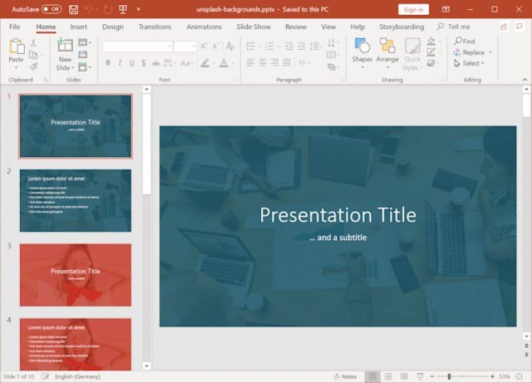
Microsoft PowerPoint is a popular programme for making slide show presentations. Microsoft PowerPoint is often used to produce slide show presentations that convey information visually using a combination of text, tables, photos, charts, and graphics.
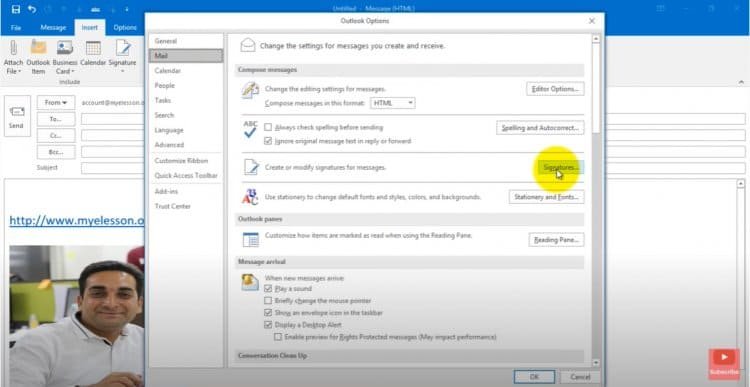
OUTLOOK
With Microsoft Outlook, you can easily organise your email, calendar, and files all in one programme. Outlook's intelligent email, calendar reminders, and contacts allow you to do more from a single powerful inbox. Connect. Organise. Get things done.